 FieldCamp
Analytics Dashboard | FieldCamp AI Dispatcher
Track dispatch performance with real-time metrics, trend charts, and activity logs. Monitor dispatch rate, response time, and visit status breakdowns.
Analytics Overview
The Analytics Dashboard gives you a high-level view of how your AI dispatching is performing. Open it from the Analytics page in AI Dispatcher at dispatcher.fieldcamp.ai.
Use the time range filter in the top-right corner to adjust the reporting window (Last 7 days, Last 30 days, etc.). All metrics and charts update to reflect the selected period.
Key Metrics
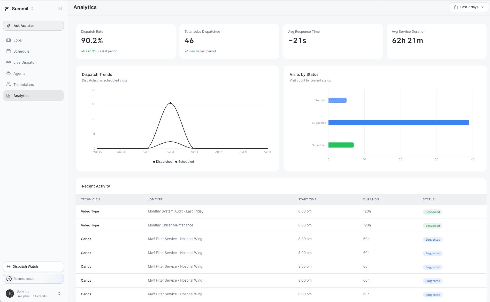
Four summary cards appear at the top of the dashboard:
- Dispatch Rate % — The percentage of incoming jobs that were successfully dispatched (either by AI or manually) within the selected time range. A higher rate means fewer jobs are sitting unassigned.
- Total Jobs Dispatched — The raw count of jobs assigned to technicians during the period. Includes both AI-dispatched and manually assigned jobs.
- Avg Response Time — The average time between a job being created and a technician being assigned. Lower is better — this measures how quickly your operation responds to new work.
- Avg Service Duration — The average time technicians spend on-site per job. Helps you calibrate your scheduling estimates against real-world performance.
If your Avg Response Time is consistently high, check the Needs Review queue on the Agents page — jobs waiting for human approval can drag this number up.
Dispatch Trends Chart
The Dispatch Trends chart shows two lines over time:
- Dispatched — Jobs that were assigned to technicians
- Scheduled — Jobs that were placed on the calendar (booked visits)
Comparing these lines helps you spot gaps. If scheduled visits consistently outnumber dispatched jobs, some visits may be getting created without proper technician assignment. If dispatched exceeds scheduled, your team is handling more ad-hoc work than planned appointments.
Visits by Status Chart
This breakdown shows how your visits are distributed across three statuses:
- Pending — Visits waiting for technician assignment or dispatch
- Suggested — AI has recommended a technician but the suggestion hasn't been accepted yet
- Scheduled — Visits confirmed and placed on a technician's calendar
A healthy operation keeps the Pending and Suggested counts low relative to Scheduled. If Suggested visits are piling up, your team may need to review and accept AI recommendations more frequently — or consider setting up a Dispatch Assistant to handle approvals automatically.
Recent Activity Table
Below the charts, a table lists recent dispatch activity with the following columns:
- Technician — Who was assigned the job
- Job Type — The service category (e.g., HVAC Repair, Plumbing Install)
- Start Time — When the visit is scheduled to begin
- Duration — Expected time on-site
- Status — Current visit status (Scheduled, In Progress, Completed, etc.)
Use this table to quickly audit recent assignments and verify that the right technicians are going to the right jobs.
The Recent Activity table refreshes automatically. You do not need to reload the page to see new dispatches appear.
Using Analytics to Improve Dispatching
Here are a few patterns to watch for:
- Dispatch Rate dropping below 80% — You may have skill gaps on your team or jobs coming in outside your service areas. Check When the AI Can't Find a Technician for troubleshooting steps.
- Avg Response Time spiking — Could indicate too many jobs require manual review. Consider widening your auto-dispatch confidence threshold or adding more Dispatch Assistants.
- Avg Service Duration increasing — Technicians may be getting assigned jobs outside their primary expertise. Review Configuring Skills & Capabilities to tighten skill matching.
Related Articles
Understanding the Schedule View | FieldCamp AI Dispatcher
Navigate the weekly schedule calendar in AI Dispatcher. View visits with time, location, duration, and travel time. Switch between Calendar, 1-hour, and Full views.
Where to Review Call Recordings and AI Summaries in FieldCamp
Call recordings, transcripts, and AI summaries in FieldCamp live under the Calls add-on (Inbox and the /calls workspace), not under AI Dispatcher. This page points you to the right docs.